Elevate
Noir Gala
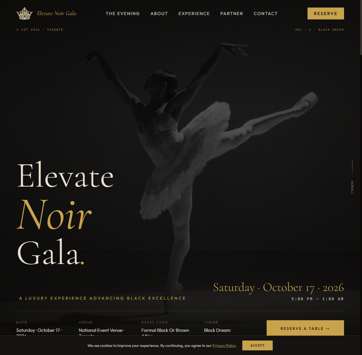
"Black Dream" — a luxury gala brand and cinematic website built to sell a premium Toronto event on atmosphere alone, before a single photo of the night existed.
The challenge
A gala is a strange product to sell. The thing being bought — one extraordinary night — doesn't exist yet when tickets go on sale. There are no reviews, no product photos, no track record a first-time attendee can check. The brand has to do all of the persuading: it has to make people feel the room before the room exists.
Elevate Noir Gala came to us with ambition and a name, and not much else. The vision was a premium black-tie event in Toronto with a distinctly modern edge — closer to a fashion launch than a hotel-ballroom fundraiser. The risk was obvious: in the events space, "luxury" is the most overused word in the dictionary, usually delivered with a script font, a champagne stock photo, and a gold gradient. If the gala looked like every other event page, it would price like every other event.
The idea: Black Dream
We anchored the identity in a single creative concept we called "Black Dream" — luxury expressed through restraint and darkness rather than sparkle. Black as a material, not an absence: deep layered blacks, charcoal textures, and a single metallic accent that reads as candlelight against the dark. Typography carries the glamour — high-contrast display type set with the confidence of a fashion masthead — so the brand never has to shout to feel expensive.
The name made the strategy easy to commit to. Noir wasn't decoration; it became the entire visual system. That's the test of a strong concept: every later decision — invitation design, site motion, photography direction — could be answered by asking "is this the Black Dream or not?"
The build
Identity system
Wordmark and monogram, a disciplined black-and-gold palette with strict usage rules, typography scales for print and screen, and art direction for the photography the event would eventually generate. Because a gala brand lives mostly on phones and invitations, the system was designed dark-first: it had to be legible and luxurious on a 6-inch screen in a dim room.
The website
The site was built as a cinematic single-page experience: full-bleed darkness, slow reveals, and content that unfolds like a program — the vision, the night, the details, the ask. Motion is deliberate and sparse; nothing bounces. Every scroll ends in the same place: a clear path to reserve a seat.
Under the surface, the page is engineered like all our builds — fast, semantic, responsive, and structured so search engines understand exactly what and where the event is. Atmosphere is no excuse for a slow site; a luxury page that takes five seconds to load has already broken its promise.
Voice
Copy was written in second person, present tense — "you arrive," "the room turns" — putting the reader inside the night instead of describing it from outside. Short lines. No exclamation marks. The restraint of the visuals carried into the language.
What the dark taught us
Designing almost entirely in black sounds simple until you try it. Without color to do the work, hierarchy has to come from somewhere else — scale, weight, spacing, and motion carry the whole composition. We ended up with a layered system of blacks (true black for depth, soft charcoals for surfaces, warm near-blacks behind imagery) so the page reads as dimensional rather than flat. The gold accent is rationed deliberately: it appears at moments of decision — a date, a price, a button — so the eye learns that gold means "act here."
Restraint also shaped the motion design. Event sites tend to over-animate, mistaking movement for excitement. We used the opposite logic: long, slow reveals and generous pauses that mimic the pacing of an unhurried evening. The site feels expensive for the same reason a good maître d' feels expensive — it never rushes you.
The other discipline was editorial. Every section had to survive the question "would a fashion house publish this?" If a block of copy read like event-listing boilerplate — "an unforgettable evening of elegance" — it was cut and rewritten around something concrete: the venue, the dress code, the program, the cause. Specificity is the difference between luxury and the costume of luxury.
The outcome
The brand gave Elevate Noir Gala what it needed most: permission to charge premium prices. The site launched ahead of the event and became the single reference point for guests, partners, and vendors — a digital venue that set expectations for the physical one. The "Black Dream" system held up across every touchpoint it met: screens, invitations, and the event collateral that followed.
Most importantly, the gala no longer competes on the events-listing shelf. It looks like nothing else in its market — which was the entire brief.
What's next
An event brand has a life cycle most brands don't: it peaks on one night, then has to carry that momentum to the next edition. The system was built for that arc — the photography direction means the gala generates its own campaign assets, and the site's structure is ready to grow from a single-event page into a recurring franchise with archives, press, and partner tiers. When ticket sales for the next edition open, the brand won't be starting from zero; it will be starting from the memory of the last room.
Services used
- Branding — concept, identity system, voice
- Web design & development — cinematic event site
Let's ignite
your brand
Planning an event, a launch, or a rebrand that can't look like everyone else's? Start the conversation.