Toronto
A&D Clinic
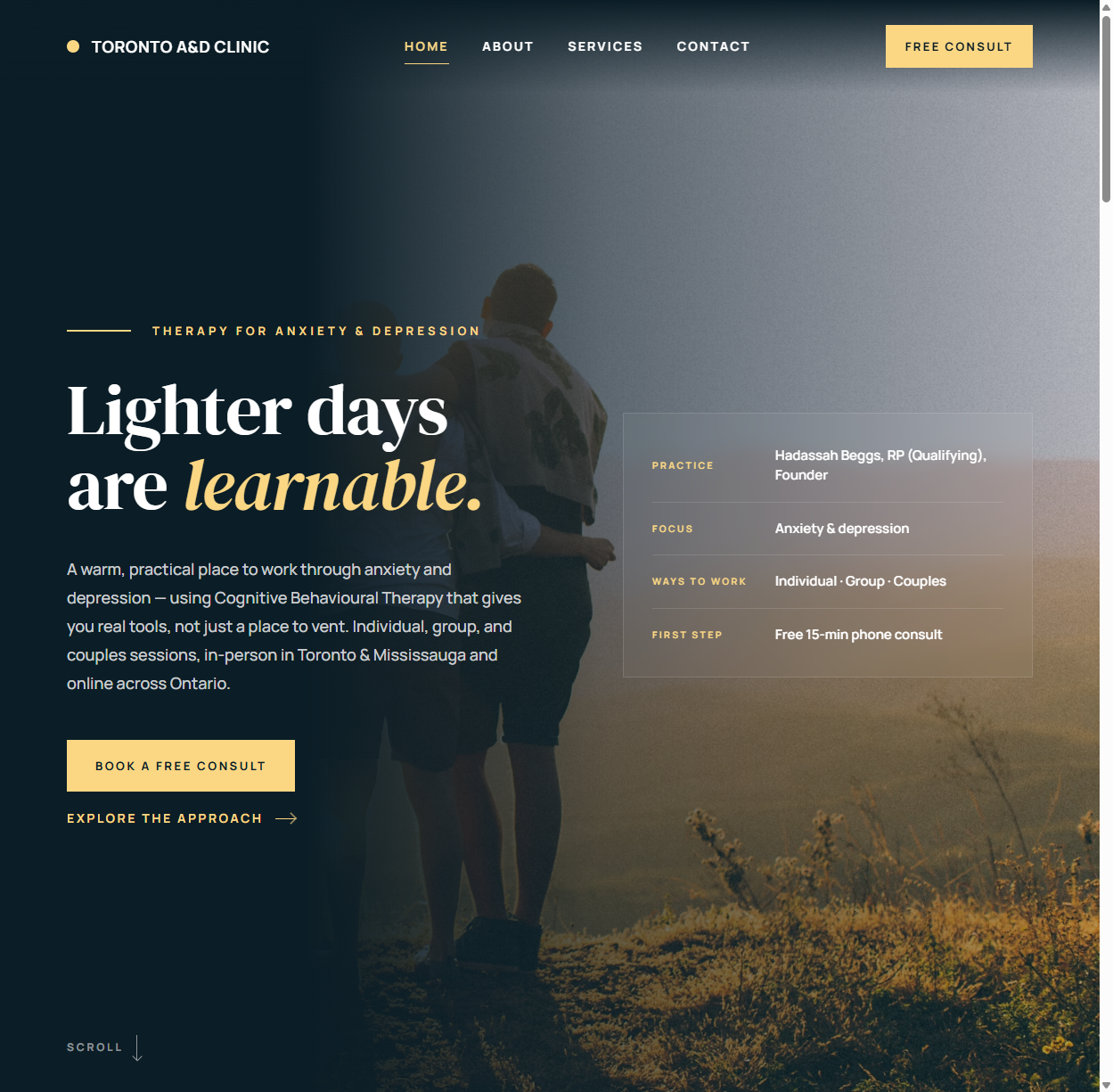
A brand and website for the Toronto Anxiety & Depression Clinic — designed for visitors who aren't browsing, but reaching out on one of their harder days.
The challenge
Designing for a therapy practice means designing for someone at a vulnerable moment. The visitor isn't comparison-shopping on features; they're deciding whether this clinic feels safe enough to call. Every design decision — color, pacing, word choice, even how a form asks its questions — either lowers the barrier to reaching out or raises it.
The clinic needed a digital presence that could do three hard things at once: feel warm without feeling unprofessional, communicate clinical credibility without the coldness of a hospital portal, and be findable by people searching for anxiety and depression support in Toronto — searches that happen at midnight as often as midday.
The approach: trust as the design brief
We treated trust as a measurable design requirement, not a mood. That meant clarity over cleverness at every turn. The identity uses a calm, muted palette and soft, humanist typography — nothing that startles, nothing that sells. The name is stated plainly and prominently, because in healthcare, ambiguity reads as risk.
The voice was the hardest and most important deliverable. Mental-health copy fails in two directions: clinical jargon that distances, or wellness-speak that trivializes. We wrote in plain, warm, direct language — naming the conditions honestly, describing what a first appointment actually looks like, and never promising what care can't promise.
The build
An unintimidating first five minutes
The site's information architecture mirrors the visitor's real questions, in order: Can you help with what I'm feeling? Who will I talk to? What happens when I reach out? Each page answers one question and ends with a gentle, pressure-free next step. The contact path was deliberately kept short and the forms minimal — every extra required field is another reason to close the tab and not call.
Accessibility as care
Accessible design is part of the clinical promise: readable type sizes, high-contrast text, full keyboard navigation, and reduced-motion respect. A practice that treats anxiety shouldn't have a website that causes it.
Built to be found
Local search is how patients arrive. The site ships with the structure that search engines need to surface a healthcare practice: location and service signals, semantic markup, fast load times, and page metadata written around how real people search for help — by condition and by city, not by clinical taxonomy.
Designing for the hardest visit
The decisive design reviews on this project weren't about aesthetics — they were about scenarios. We tested every page against the hardest plausible visitor: someone exhausted, anxious, reading on a phone in the dark, with one bar of patience left. That lens vetoed a surprising amount of conventional design. Autoplaying anything: gone. Cleverness in navigation labels: gone — "Our Services" beats a poetic metaphor when someone needs to find help fast. Stock photos of people laughing on beaches: gone, replaced with imagery that feels like the actual experience of care.
The same lens shaped the reading experience. Paragraphs are short and front-loaded, so a skimming reader gets the reassurance early. Each condition page opens by normalizing — "anxiety is the most common reason people seek therapy" — before describing treatment, because the first job of the copy is to make the reader feel less alone, not to sell a service. Clinical credentials appear where trust is decided: next to the booking step, not buried on a bio page.
Even the color system earned its keep functionally. Muted, low-saturation tones aren't just "calming" by association — they keep contrast comfortable for long reading and let the one saturated element on each page, the booking action, stand out without shouting. In trust-driven design, the quietest page usually converts best.
The outcome
The clinic now presents the way it practices: calm, credible, and human. The site gives prospective patients a clear, low-pressure path from "searching at midnight" to "booking a consultation," and gives the practice a foundation that local search visibility can compound on.
It's also the project that best represents how we think about design: the same rigor we bring to a luxury gala brand, pointed at the opposite goal — not impressing the visitor, but reassuring them.
What's next
Healthcare is where search visibility compounds most powerfully, because patients search by condition and city — high-intent queries that a well-structured practice site can own over time. The site's foundation was built for exactly that growth: condition pages that can deepen into genuine resources, local signals ready for directory and map presence, and a content structure that supports answering the questions patients actually type — including the ones now asked to AI assistants instead of search bars. For a clinic, every ranking gained isn't traffic; it's someone who found help one search sooner.
Services used
- Branding — identity, voice, trust-first design language
- Web design & development — accessible, findable practice site
Let's ignite
your brand
Run a practice or a trust-driven business? Your website should be your most reassuring first impression. Start the conversation.